Bootstrap provides different styles of buttons. You can use any of the available button classes to quickly create a styled button. As a best practice, Bootstrap highly recommend using the <button> element whenever possible to ensure matching cross-browser rendering.
Buttons Styles
Examples:

<!-- Standard button -->
<button type="button" class="btn btn-default">Default</button>

<!-- Provides extra visual weight and identifies the primary action in a set of buttons -->
<button type="button" class="btn btn-primary">Primary</button>

<!-- Indicates a successful or positive action -->
<button type="button" class="btn btn-success">Success</button>

<!-- Contextual button for informational alert messages -->
<button type="button" class="btn btn-info">Info</button>

<!-- Indicates caution should be taken with this action -->
<button type="button" class="btn btn-warning">Warning</button>

<!-- Indicates a dangerous or potentially negative action -->
<button type="button" class="btn btn-danger">Danger</button>

<!-- Deemphasize a button by making it look like a link while maintaining button behavior -->
<button type="button" class="btn btn-link">Link</button>
Button tags
Use the button classes on an <a>, <button>, or <input> element.

<a class="btn btn-default" href="#" role="button">Link</a>
<button class="btn btn-default" type="submit">Button</button>
<input class="btn btn-default" type="button" value="Input">
<input class="btn btn-default" type="submit" value="Submit">
Sizes
Fancy larger or smaller buttons? Add .btn-lg, .btn-sm, or .btn-xs for additional sizes.
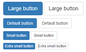
<p>
  <button type="button" class="btn btn-primary btn-lg">Large button</button>
  <button type="button" class="btn btn-default btn-lg">Large button</button>
</p>
<p>
  <button type="button" class="btn btn-primary">Default button</button>
  <button type="button" class="btn btn-default">Default button</button>
</p>
<p>
  <button type="button" class="btn btn-primary btn-sm">Small button</button>
  <button type="button" class="btn btn-default btn-sm">Small button</button>
</p>
<p>
  <button type="button" class="btn btn-primary btn-xs">Extra small button</button>
  <button type="button" class="btn btn-default btn-xs">Extra small button</button>
</p>
Create block level buttons
Span the full width of a parent— by adding .btn-block.

<button type="button" class="btn btn-primary btn-lg btn-block">Block level button</button>
<button type="button" class="btn btn-default btn-lg btn-block">Block level button</button>
Active state
Buttons will appear pressed (with a darker background, darker border, and inset shadow) when active. For <button> elements, this is done via :active. For <a> elements, it’s done with .active. However, you may use .active on <button>s (and include the aria-pressed="true" attribute) should you need to replicate the active state programmatically.
<button type="button" class="btn btn-primary btn-lg active">Primary button</button>
<button type="button" class="btn btn-default btn-lg active">Button</button>
Disabled state
Make buttons look unclickable by fading them back with opacity.

<button type="button" class="btn btn-lg btn-primary" disabled="disabled">Primary button</button>
<button type="button" class="btn btn-default btn-lg" disabled="disabled">Button</button>